Wellbeing Compass
Helping Evolve to reach out to more children and improve their lives by re-designing the wellbeingcompass.com and data-collecting tool.
Duration: 3 Weeks group project
Team: Kate Sniegocka, Lalitha Calidas, Harerta Zahaya, Ugur Elmastas
My Role: UX Research, UX Design, UI Design, Visual Design
Tools: Sketch, InVision, Miro, Adobe Photoshop, Adobe Illustrator, Adobe Color, Google Forms, Stark, Trello, Zoom, Google Hangouts, Slack
Overview
The Client project for Evolve, a social enterprise and their wellbeingcompass.com website. The Wellbeing Compass measures an individual's wellbeing using a short series of validated questions. The system is simple to use and only takes 10 mins to complete the survey. The system integrates with school management systems and the results can be correlated with pupil performance data in schools. This helps school leaders to focus more on pupil wellbeing when they see the direct relationship it has on academic outcomes. They have approximately 50 schools using the system but there is significant demand in the education market for the service.
Problem
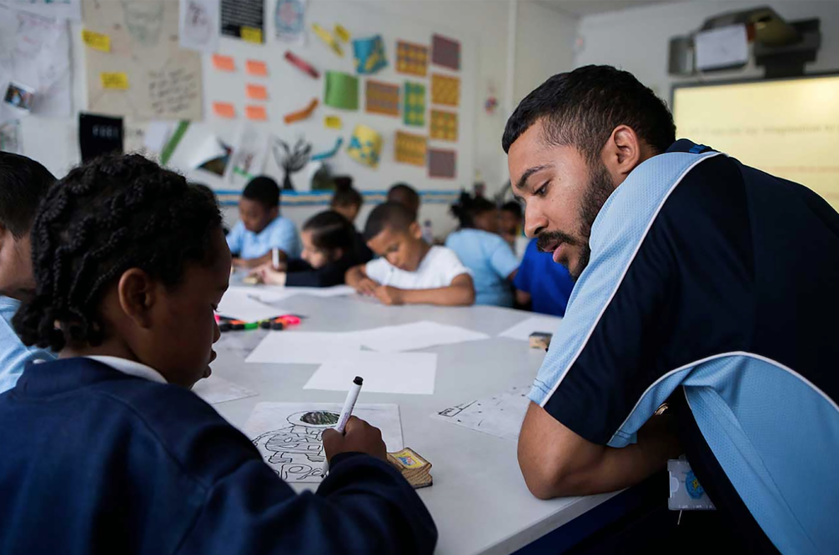
The brief aimed to enable students to complete the Wellbeing Compass survey without external assistance from the Health Mentors. Make the students feel motivated to complete the surveys at regular intervals, and also effectively explain the Wellbeing Compass tool on the company homepage. I worked within the team of four UX Designers and took roles within the whole process to complete the brief remotely, due to the challenges posed by the global pandemic of Coronavirus.
Design Process
User Research
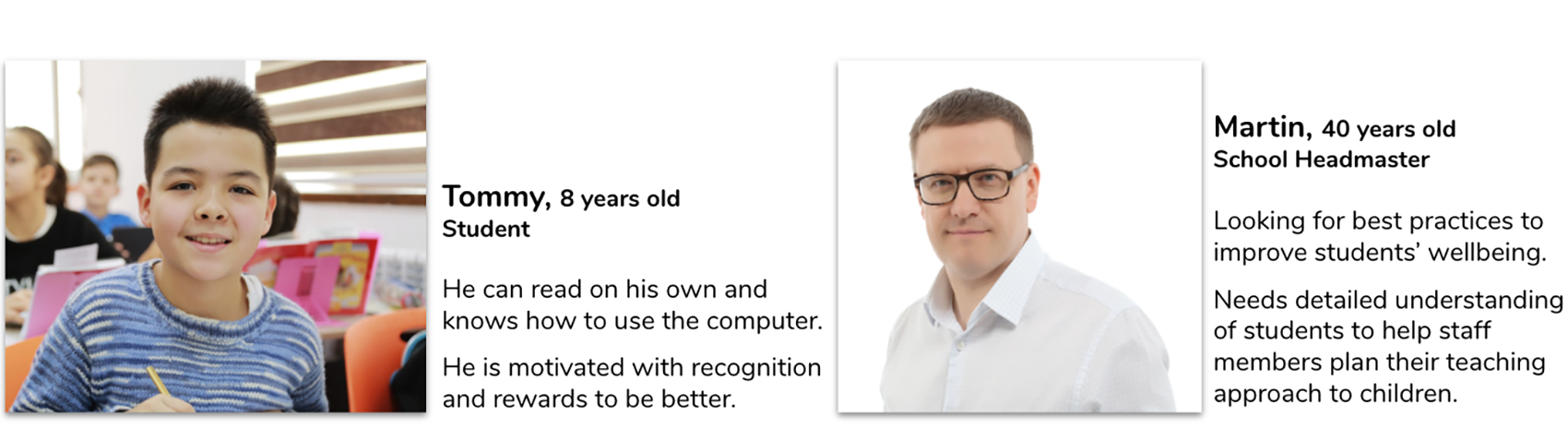
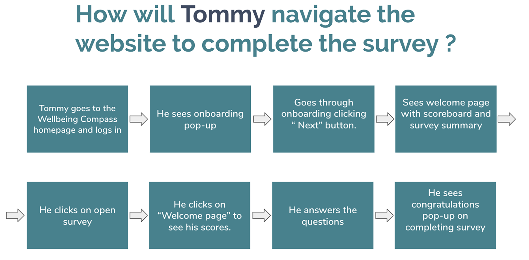
As part of the user research process, we also conducted 20 surveys and 14 interviews. And the key findings were that currently, schools only have a weekly assembly where students are recognized and rewarded, which is not enough to keep them motivated. Also, students complete the survey only once during a school term, which doesn’t give enough data to fully understand the progress of a student within a term and were supported with their social and mental wellbeing only when instances happen. Based on all findings we then developed our main persona Tommy, who is an eight years old student and Martin, who is a school headmaster. We focused on Tommy’s journey but looked at the homepage through our persona Martin as it targeted a different audience.
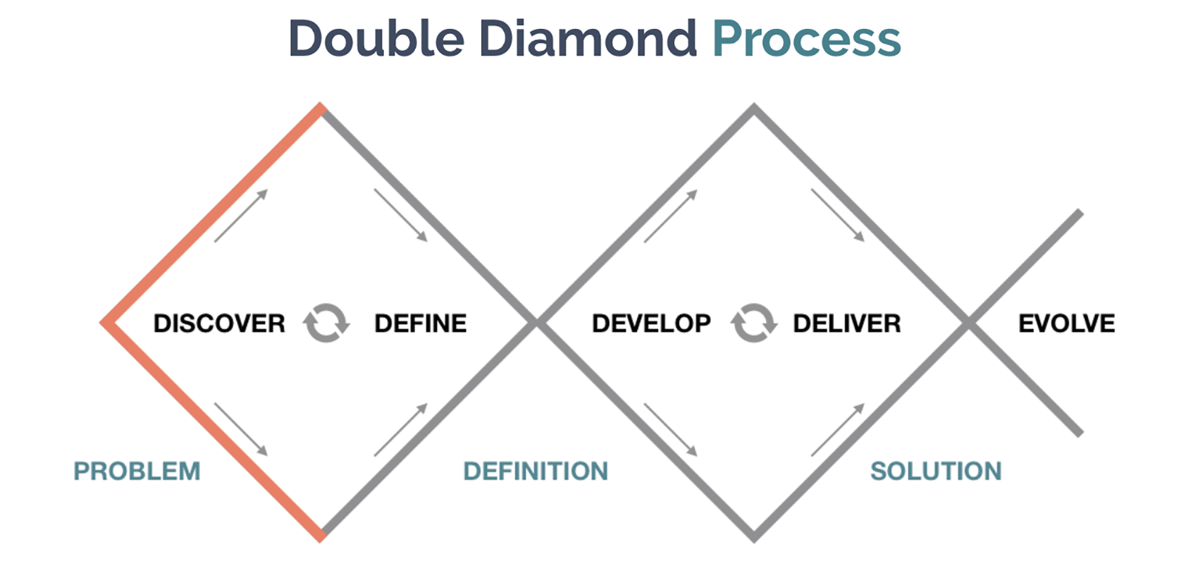
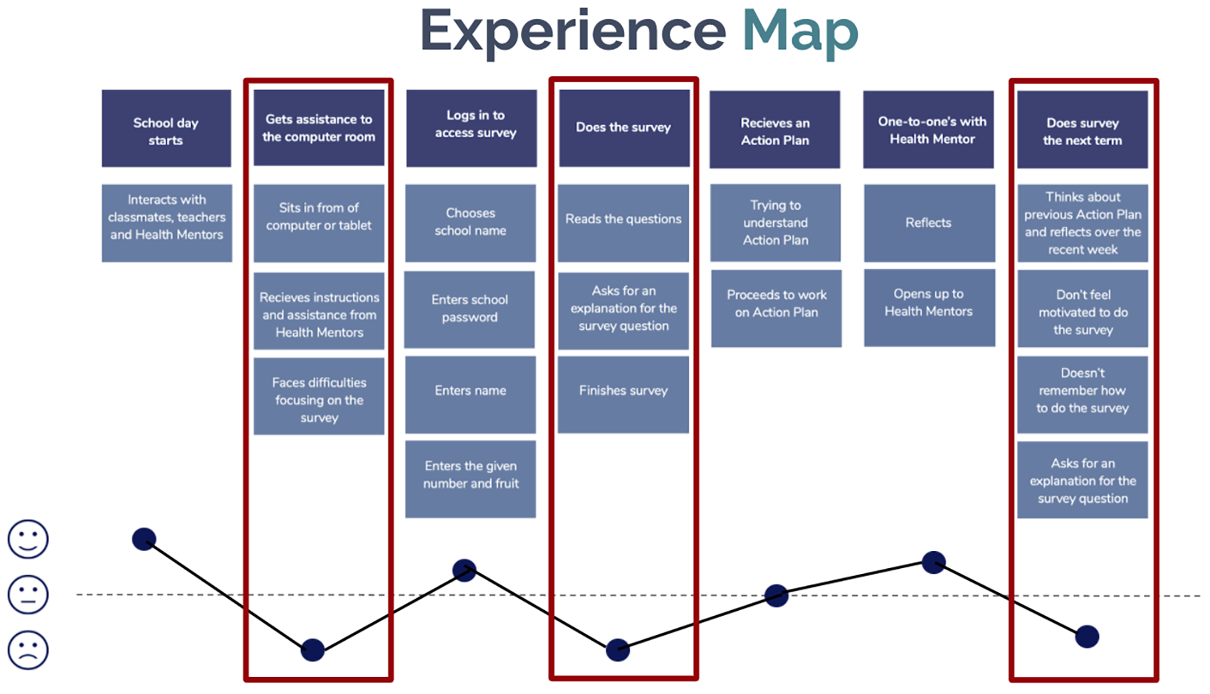
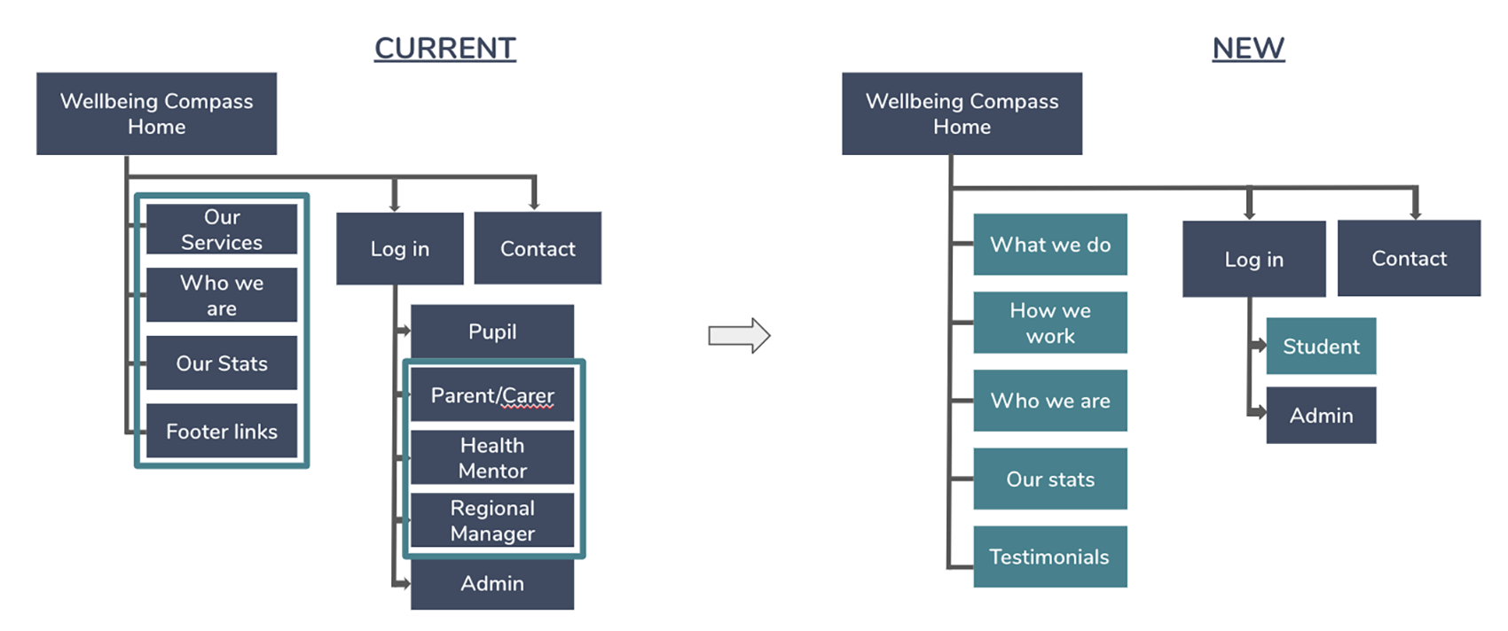
Information Architecture
Having our personas in mind, the next steps were to establish the user flow for Tommy and design a site map for Martin, which was the architecture of the homepage. The new sections were added in to better explain the purpose and functionality of the tool, also we created a storyboard to highlight the benefits of the product and testimonials and statistics to prove it. We thought about a potential way to help Tommy to navigate and complete the survey independently and created a hypothesis; By creating a clear onboarding process through playful visuals, we believe that Tommy will understand the survey more easily and be able to complete it independently.
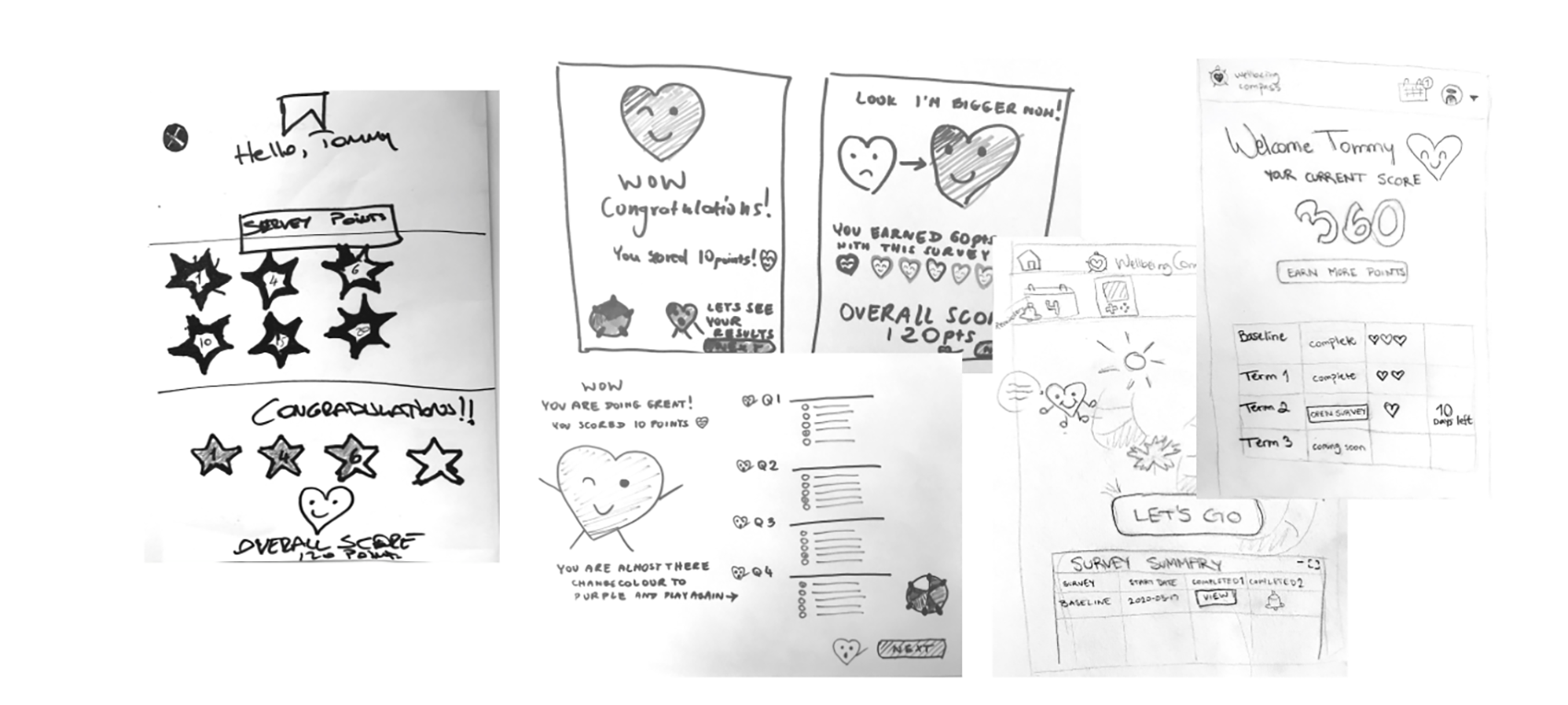
Ideation and Prototyping
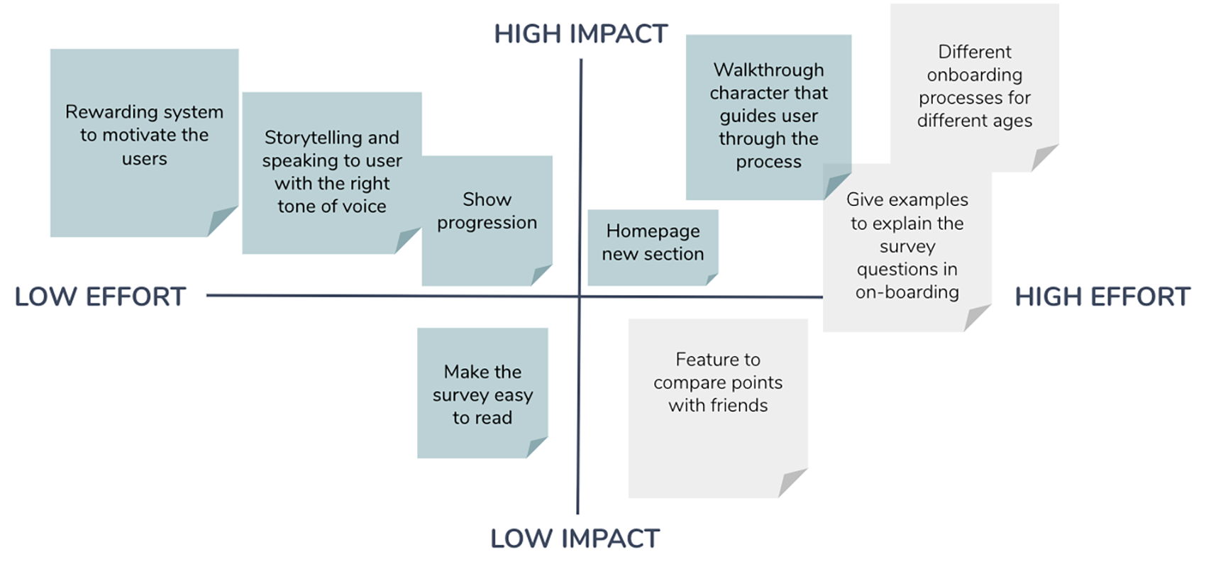
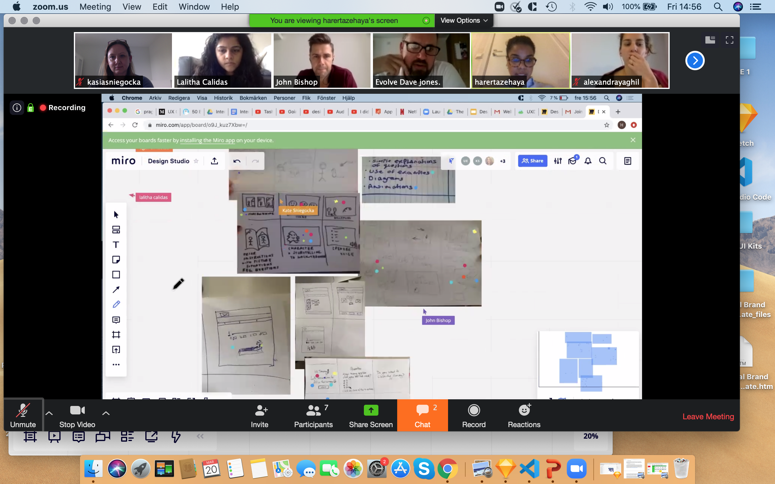
We tried to solve the most common user problems and looked at how might we help Tommy, our persona, to understand better how to fill in the survey and motivate him to complete more surveys in the future, and conducted a remote Design Studio with our Client, using Zoom and Miro board. As the next step, we went through the process of Futures Prioritization to ensure we will be able to solve the main user problems and also answering the requirements specified within the brief within the time and resources available. One of the key ideas developed from the design studio was the thought of rewarding pupils for doing the survey, so we have decided to implement something called a Hook Model into our product. You can read more about the Hook Model and how our team used it in the Wellbeing Compass product in my full Case Study on Medium.
User Testing
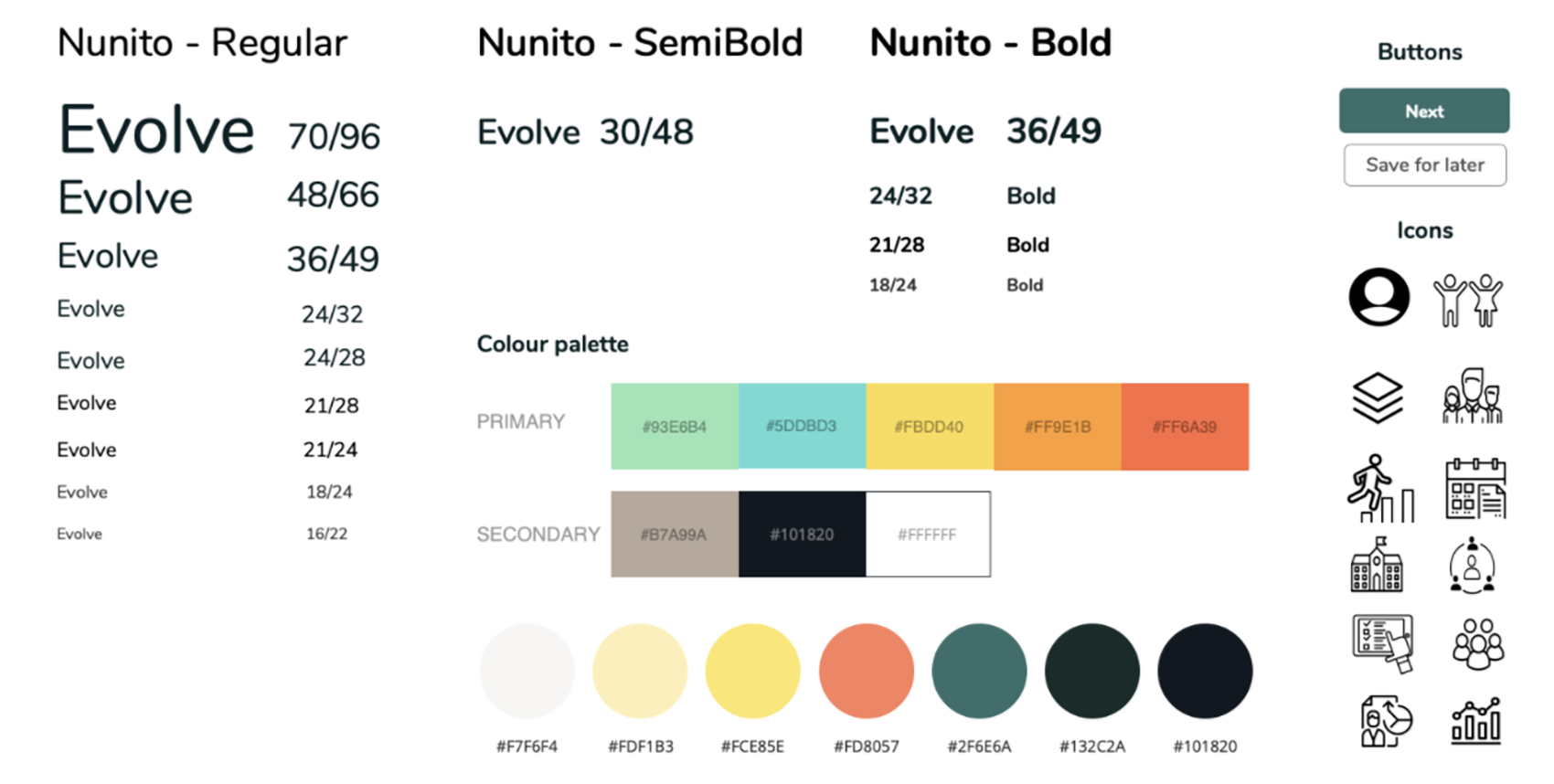
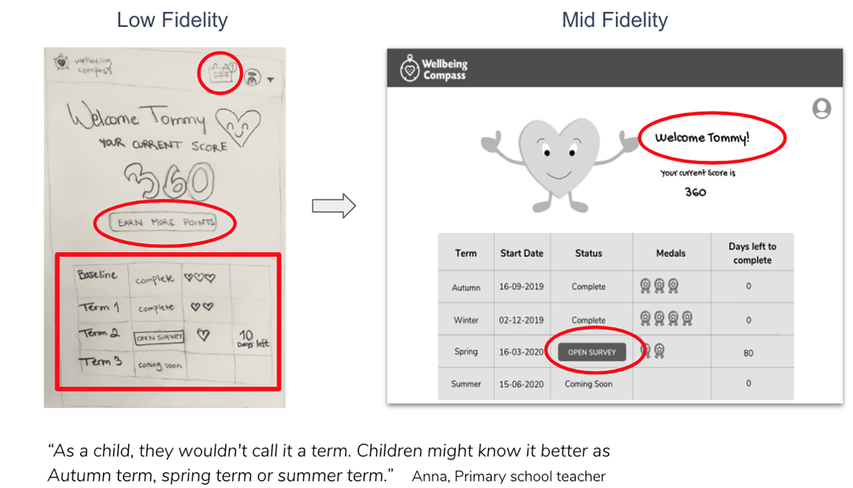
Based on the ideas, we created a prototype by starting with the low fidelity paper prototype, through to mid-fidelity and high fidelity digital prototype and tested them on 24 different users in three key stages; teachers, parents and also children in the age similar to our persona; seven, eight and nine years olds. We used all the feedback to constantly develop and iterate our design while having our main user in mind throughout the entire development process. For more information about testing and iterations, please read my Medium Case Study.
Next Steps
We have proposed a few further development ideas to our Client Evolve, development of the second onboarding processes for older students, development of the administrator’s dashboard and implementation of the notification feature for their login. Also, adding interactive dynamics to show changes in features when working with web developers (including audio and animations) and more user testing to improve the product.
Final Solution
The outcome is a re-designed homepage with the new content and sections that better explains the Wellbeing Compass tool and its process. The second outcome is a re-designed survey tool, where we implemented an onboarding process to enable students to complete it more independently. Also, new survey pages, where we used the storytelling and implemented a Hook Model to motivate users and reward them for their participation and loyalty every time they come back to repeat the process.
I’m the most proud of that since with this project outcome, we were able to make a difference to the end-users, the vulnerable children. They are now able to complete the survey independently and have a much more enjoyable experience while using the tool. Also, the Health Mentors who evaluate data and create action plans based on results have more valuable data to analyse. Students will be able to complete the surveys more frequently, which will result in life improvement for the children.