East-West Organization
Helping East-West Charity Organization to clearly communicate their mission and values through the website re-design.
Duration: 5-Days individual project
My Role: UI Design, Visual Design, Brand Design
Tools: Sketch, Adobe Photoshop, Adobe Illustrator, Adobe Color, Mood board, Google Fonts, Zeroheight, Stark
Overview
Problem
Looking at the East-West website, quickly became clear that many visual design challenges needed to be solved to improve the overall user experience. Many charity websites are poorly designed due to the lack of funds, but like any other websites, they are the face of every organisation. They aim to communicate what are the goals of the organisation and find people that would support and get involved in helping to achieve them.
How did I approach the problem?
Brand Values
My design process started with creating a brand personality framework to define what the main values for the East-West charity are, and how they should be positioned as an organisation. Going through the process of trying to defined and name their main brand values brought me to the conclusive few words that best described their personality: Community, Discovery, Openness, Support and Trust.
Brand Positioning
Key discoveries were; that the brand had an informal feel, his look and tone of voice were simple and gentle. It looked traditional, warm and quite colourful. Single words that best described what the charity does were holistic intervention.
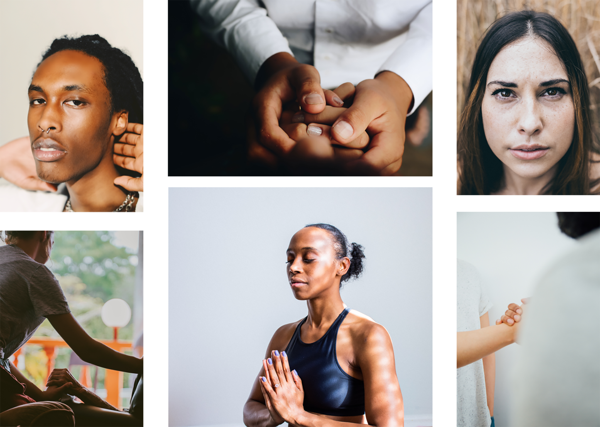
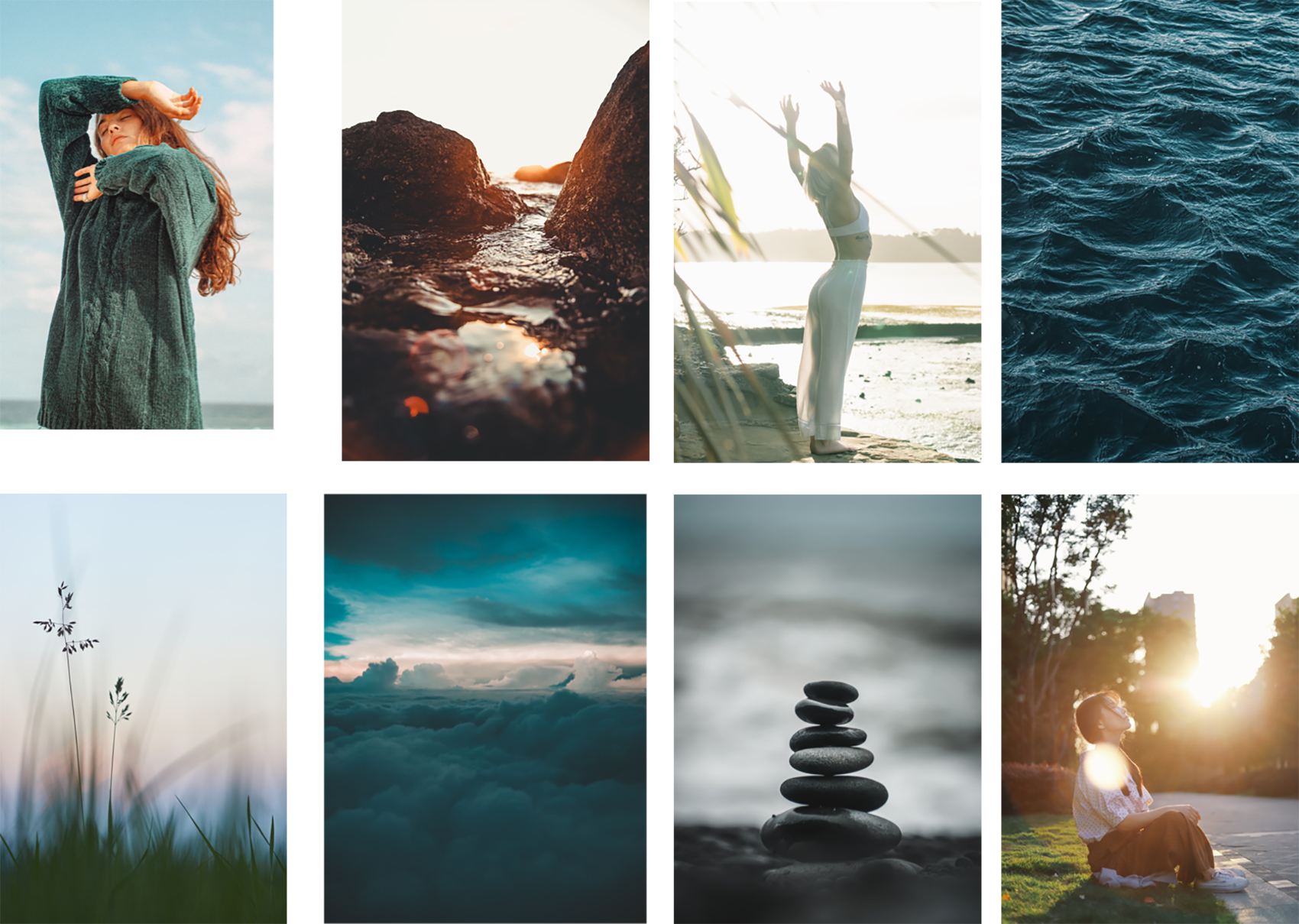
Moodboard
Typography
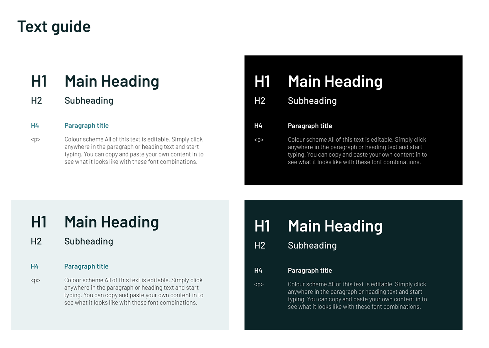
I chose Barlow as the main typeface, slightly rounded, non-serif font with a large family option. As the Charity combines conventional therapy with eastern philosophy, my thought was that typography should be minimalistic and quite simple to best reflect their brand.
Ideation
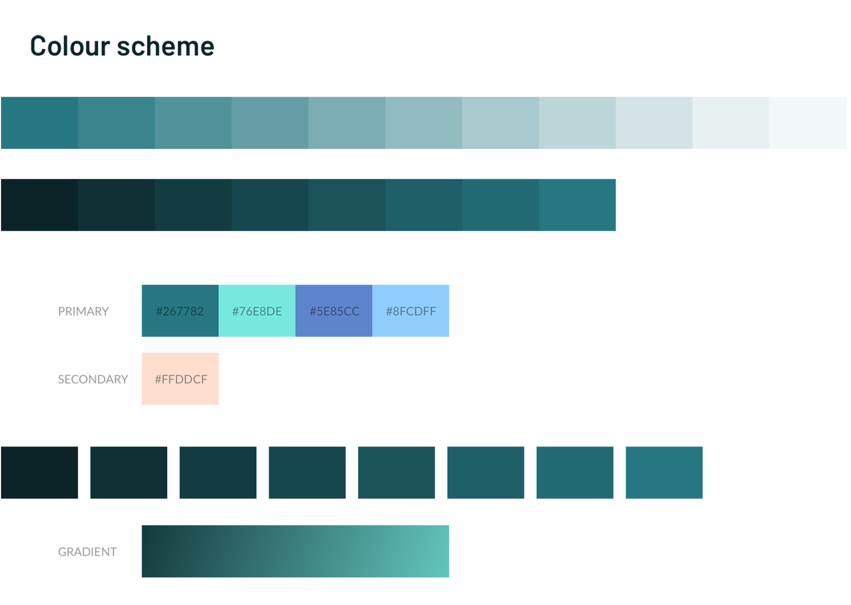
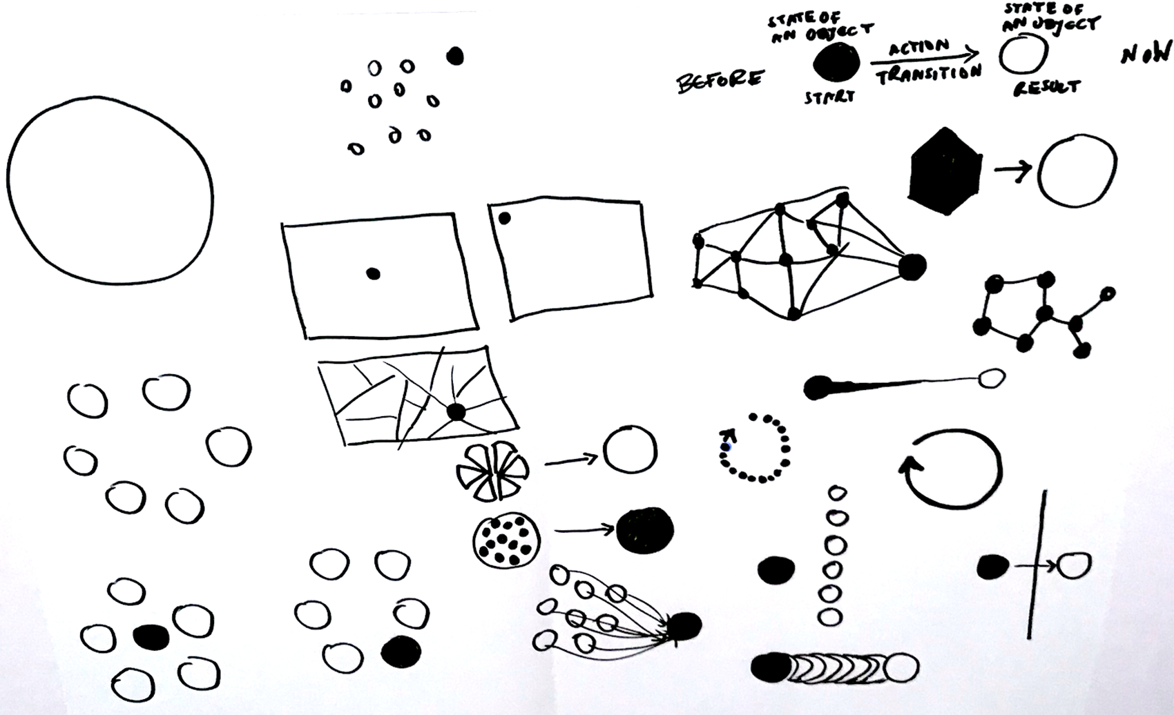
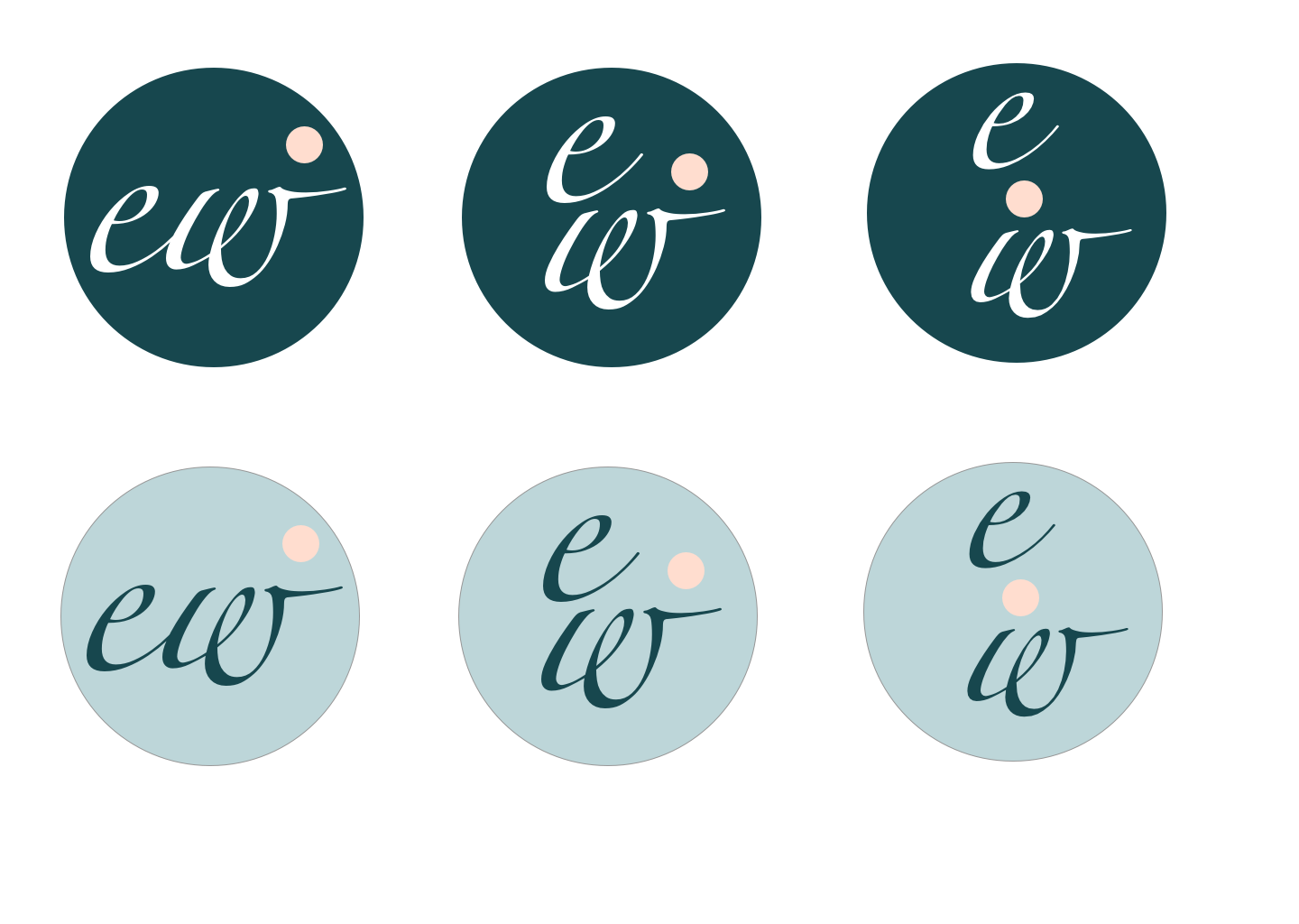
I started to sketch some ideas to visualise the concept of holistic interventions as a journey/path using simple graphical shapes. Based on the sketches and colour scheme the next step was to sketch some ideas for the new logo and start to develop my ideas further. Also, start to translate these ideas into wireframes and as the next step start to create a prototype for the new website in Sketch.
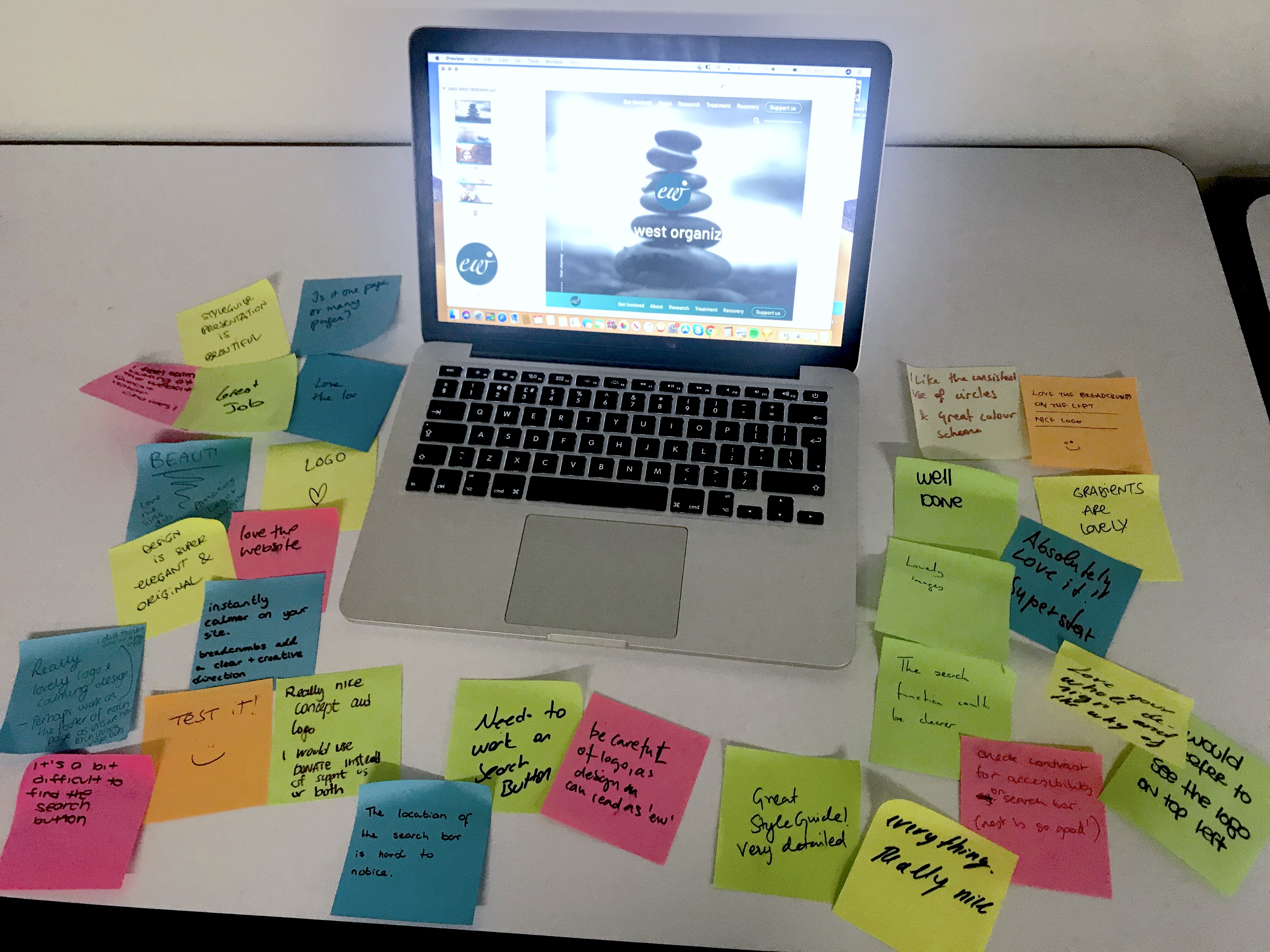
Testing
During User Testing I discovered some key problems. There was no clear indication of where the users are on the site at any time. Support us button wasn’t aligned with the rest of the design. Users were also not sure about the logo positioning on the page.
As a solution I iterated design by adding breadcrumbs to each page to help users navigate confidently through the pages, moving support button to the right side of the global navigation and changing its outline colour. Also, logo positioning was changed to sit within the global navigation bar and placed to serve as a home button.
Final Solution
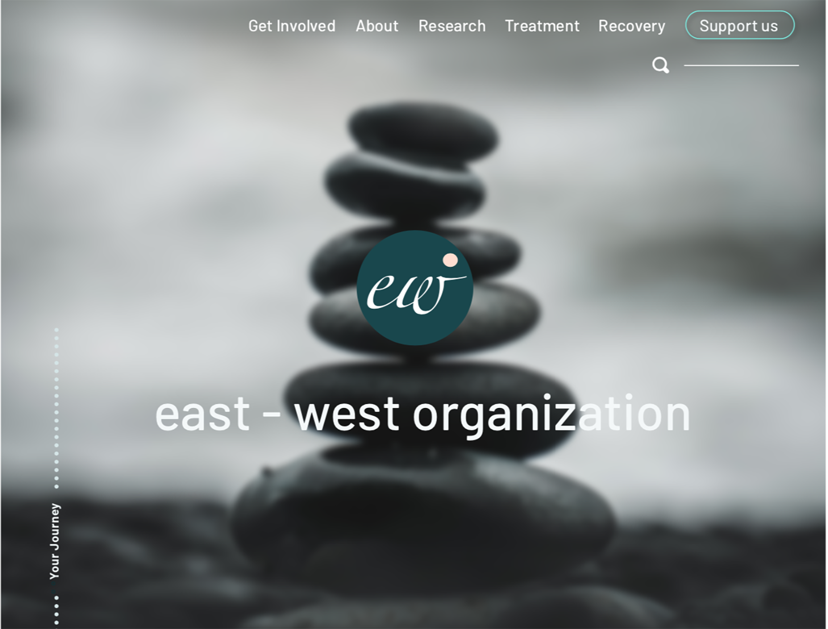
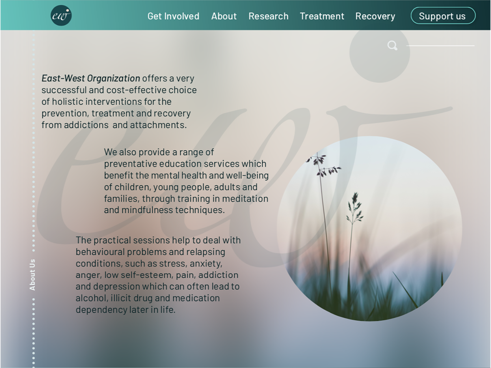
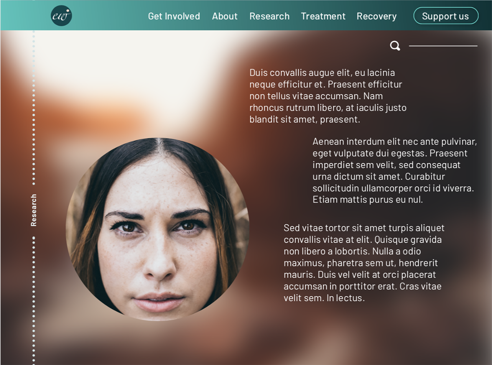
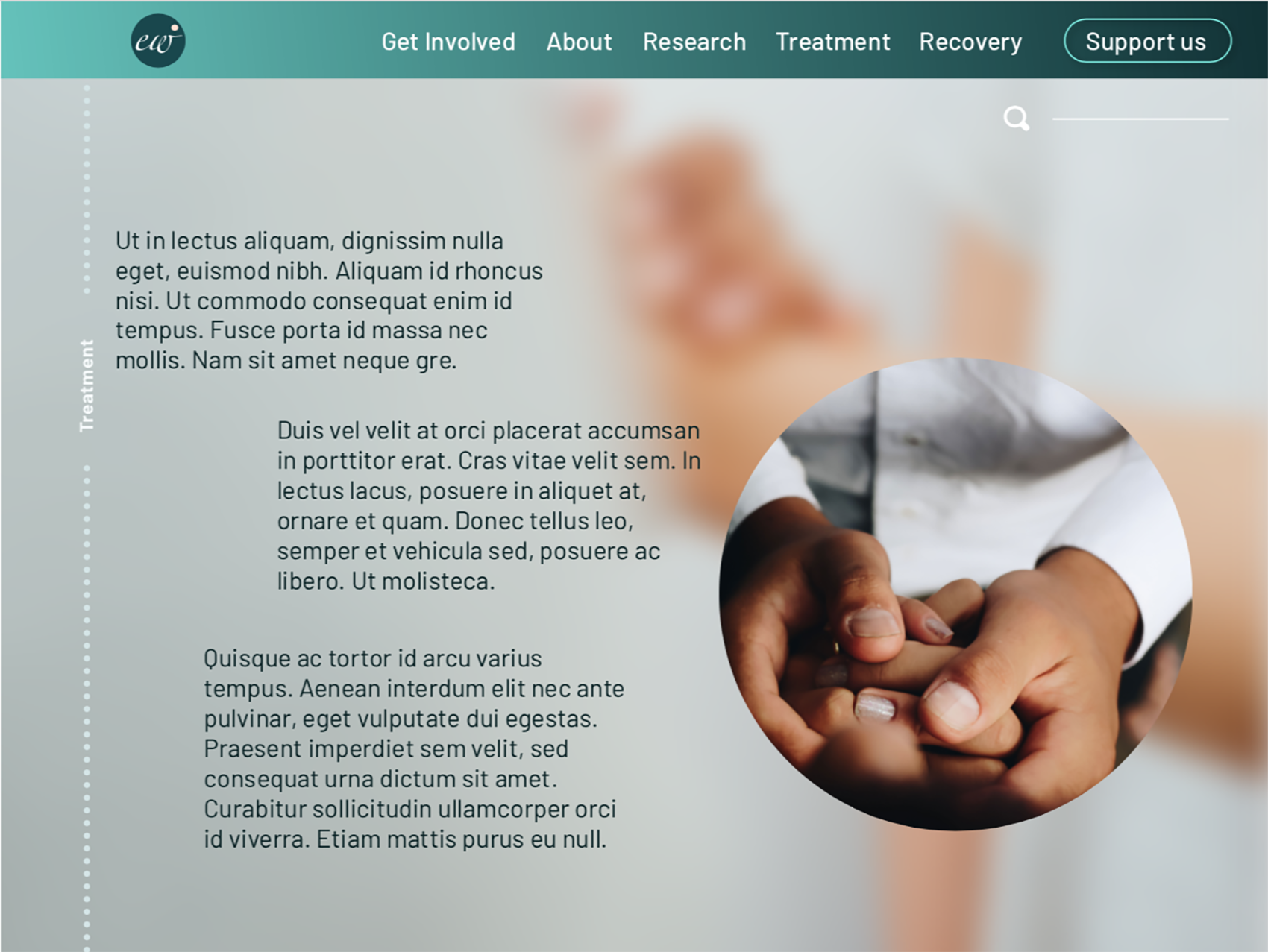
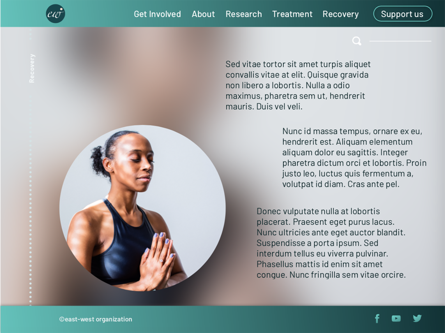
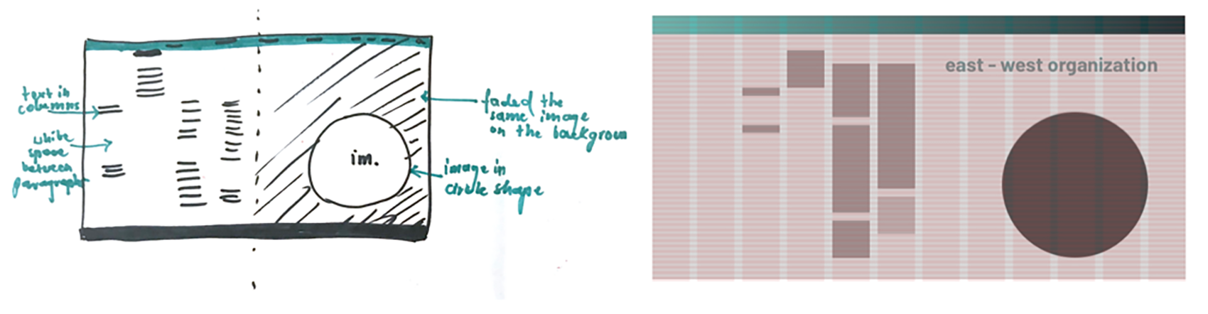
High-Fidelity Prototype
When moving onto the high fidelity prototype, the biggest challenge was to show the brand personality while keeping the website design simple and clear at the same time. I used blurred background images to create a mood and texture, placed the main imagery within the consistent circles’ cut-outs and treat the whole design as a process, when the user scrolls down and goes through different pages, it will be taken on the journey from East-West Organisation introduction, through research information about the problem, treatment options page, down to the final recovery. The mood of the pages will also change depending on the content.